CSS 实现圆角梯形#
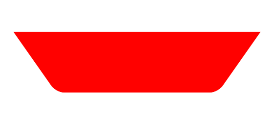
下圆角梯形#
<div class="rounded-trapezoid-bottom"></div>.rounded-trapezoid-bottom {
width: 200px;
height: 60px;
background: #f00;
border-bottom-left-radius: 10px;
border-bottom-right-radius: 10px;
transform: perspective(20px) rotateX(-8deg);
}
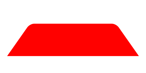
上圆角梯形#
<div class="rounded-trapezoid-top"></div>.rounded-trapezoid-top {
width: 200px;
height: 60px;
background: #f00;
border-top-left-radius: 10px;
border-top-right-radius: 10px;
transform: perspective(20px) rotateX(8deg);
}
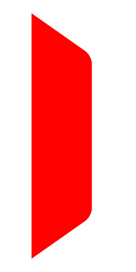
右圆角梯形#
<div class="rounded-trapezoid-right"></div>.rounded-trapezoid-right {
width: 60px;
height: 200px;
background: #f00;
border-top-right-radius: 10px;
border-bottom-right-radius: 10px;
transform: perspective(20px) rotateY(8deg);
}
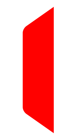
左圆角梯形#
<div class="rounded-trapezoid-left"></div>.rounded-trapezoid-left {
width: 60px;
height: 200px;
background: #f00;
border-top-left-radius: 10px;
border-bottom-left-radius: 10px;
transform: perspective(20px) rotateY(-8deg);
}
大纲